
We offer a wide range of gifts that you can design and personalise with your favourite photos. But not just that, we also have plenty of creative ideas to help you personalise your gifts in a unique way.
From step-by-step instructions for DIY photo projects to ideas for the perfect table decoration and tips on taking photos, we’re here to help you make the most of your gifts and photo products.
Drop in regularly for fresh inspiration and let your creativity flow!
Filter products
Authors
Topics
Categories

Mother’s Day: Date, Meaning & Origins explained simply
When is Mother’s Day 2026? Here you’ll find the exact date, plus the meaning and origins explained simply – along with ideas for a lovely surprise.
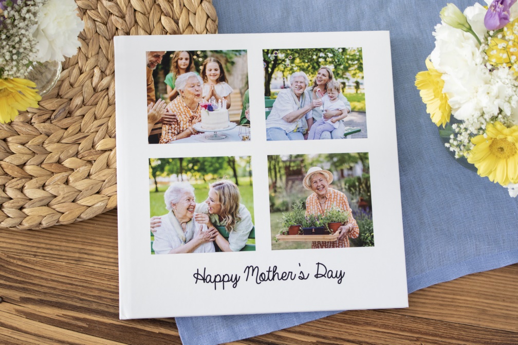
An Individually Designed Photo Book for Mother’s Day
An individually designed photo book is a great gift for Mother's Day. You can add your favourite photos and memories. We will give you 6 helpful design tips.
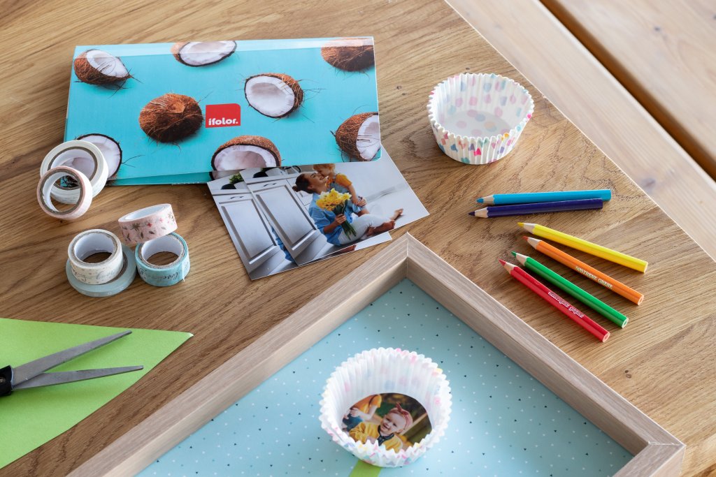
Mother's Day gifts made with kids: Easy ideas (from age 3)
Quick and easy Mother's Day gift crafts with kids: ideas from age 3, with little material and step-by-step instructions.
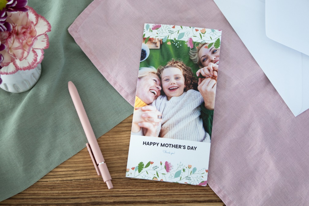
Sending a Personalised Mother’s Day Message
Individually design a greetings card for your mum this Mother's Day and add a personal message to show your appreciation for everything she has done.

Photo Gifts for Mother's Day
Finding the perfect gift for Mother's Day is easy. We will give you some great ideas for creative and unique photo gifts.
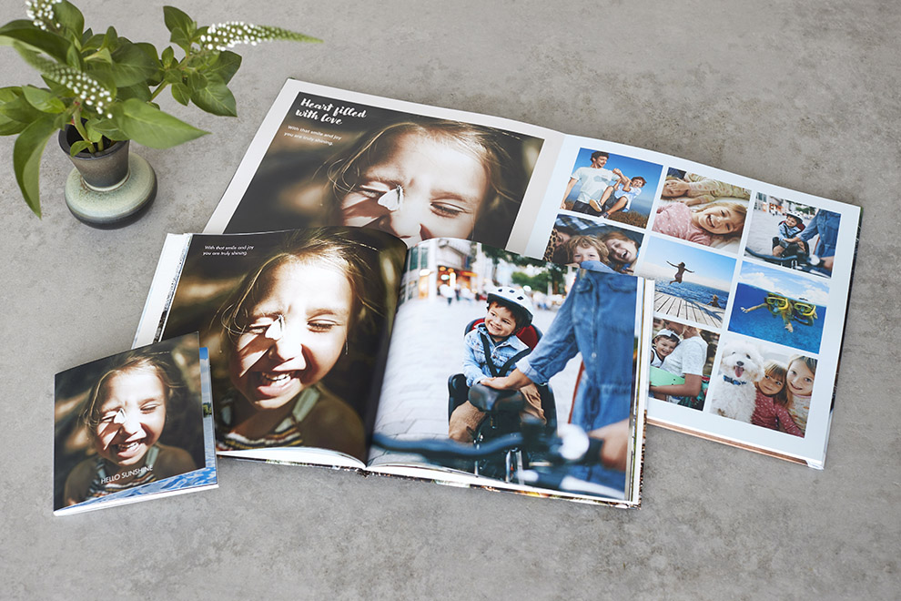
Unleash your inner designer: Three ways to design a stunning photo book
Ever wondered what kind of epic photo book you could whip up in just 15 minutes? Or maybe you're ready to dive into an hour-long creative frenzy? Compare these three options and choose the best one that’s right for you.
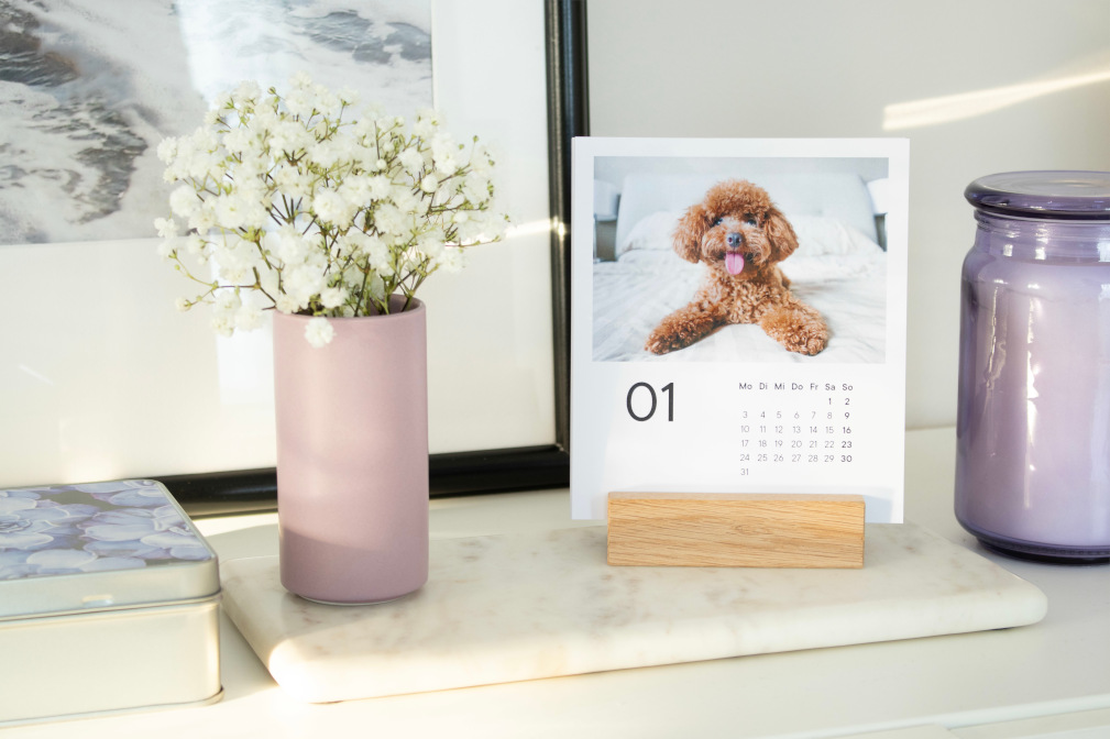
Unique and stylish decorating tips
Make your four walls a home lovely. We show you personalised design tips and decoration ideas for a stylish home.
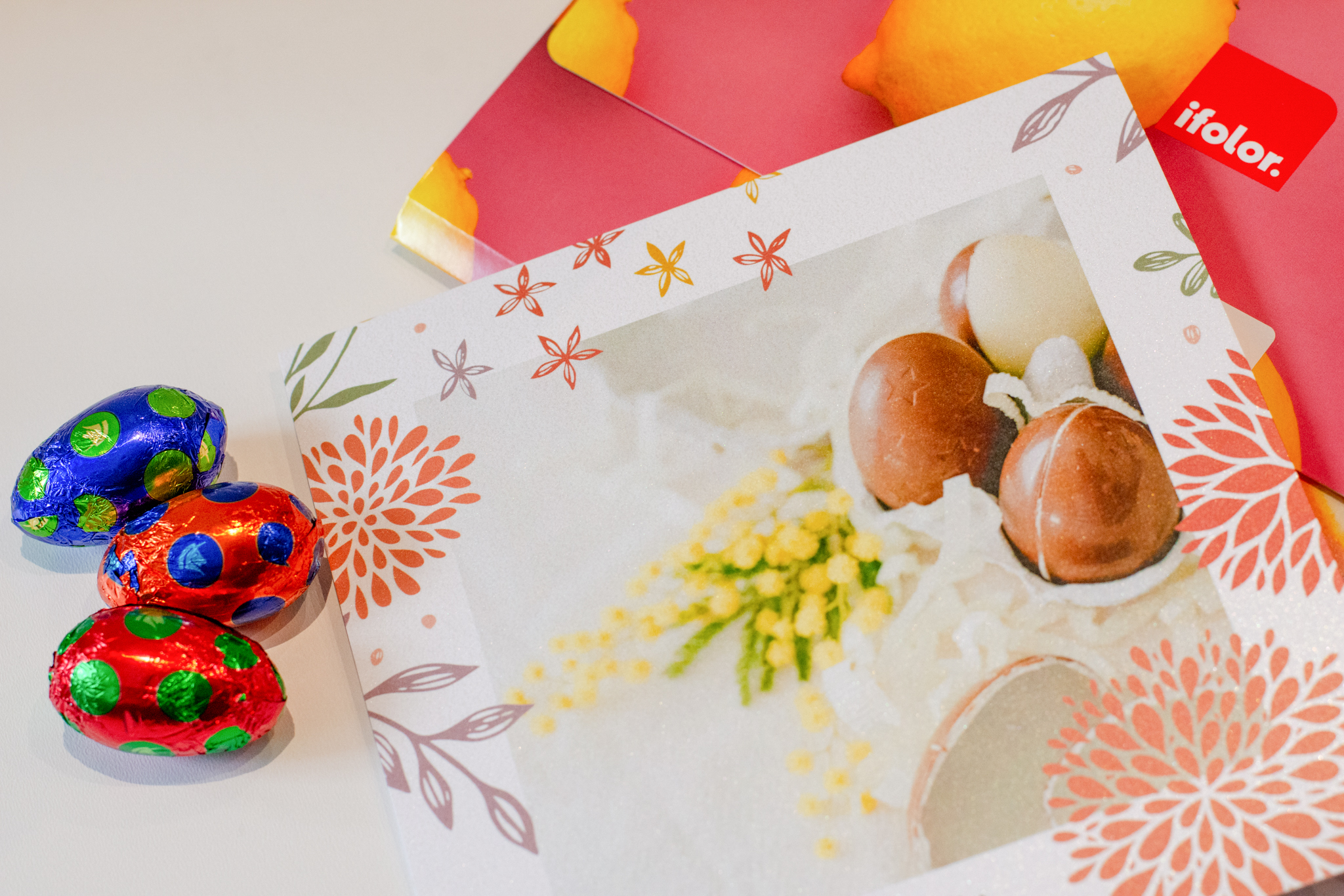
Easter Card Messages & Wishes
If you are not sure what to write in your Easter card, get inspired by our article on Easter card messages and wishes.
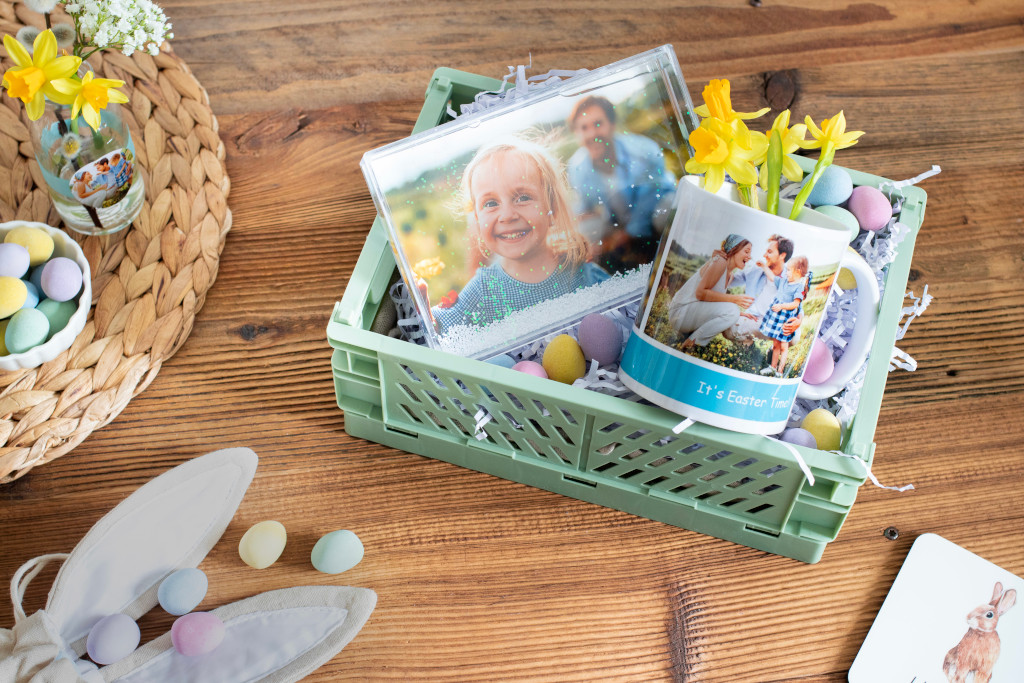
Easter nest with a difference
Discover our five ideas for making creative Easter gifts from photo products. There's something for everyone!
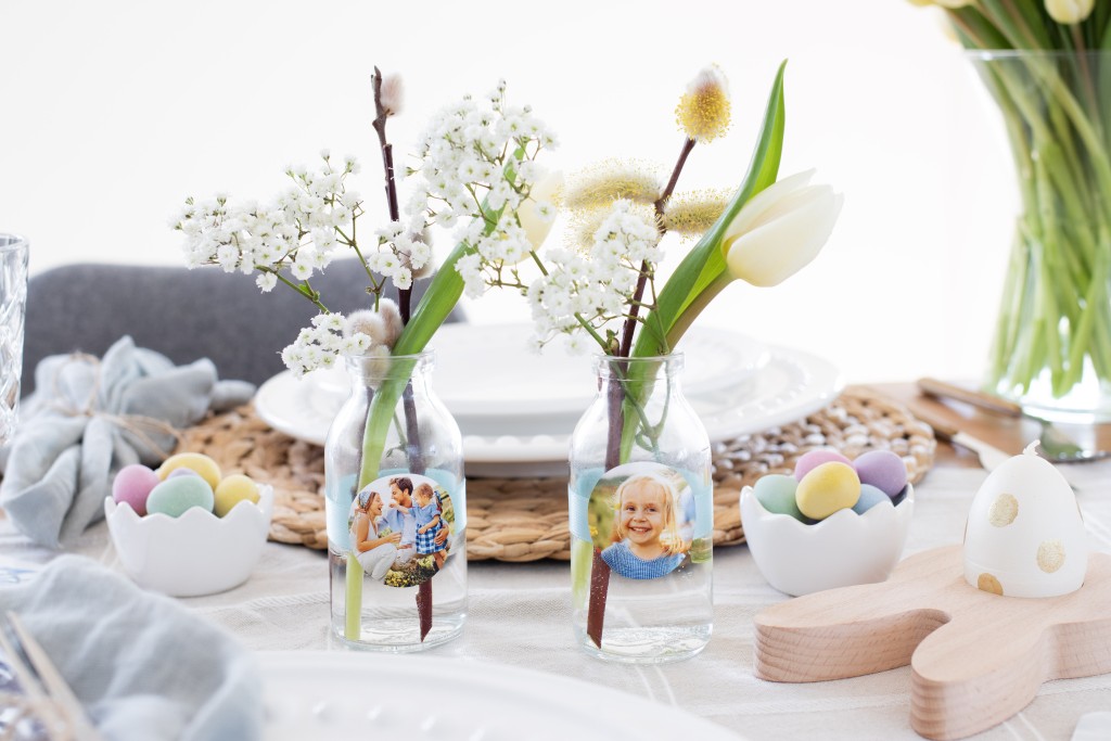
DIY: Table Décor and Tiny Surprises for Your Easter Brunch
Get inspired by our creative ideas for Easter. In this article you will find some creative craft and gift ideas for Easter.

Creatively design a Photo Puzzle into a voucher
Treat family and friends with a photo puzzle voucher. We show you some ideas and great designs.

Your Very Personal Winter Moments
Tips & tricks for choosing pictures and creating your winter holiday Photo Book using ifolor Designer or the ifolor phone/tablet app.

Capture winter photo moments
Capture your best winter holiday photos as impressive wall decorations, personalised photo gifts, or lovingly designed photo books.

Shooting Brilliant Winter Sports Photos
Winter sports photos: We tell you what to look out for in winter sports photography and how to capture your best winter moments.

How to create the perfect travel photo book from your holiday photos
How would you like to create the perfect photo book that captures the highlights of your trip? Design a travel photo book that is just as unique as your adventures. Hands down the best souvenir, a photo book captivates viewers with every detail.
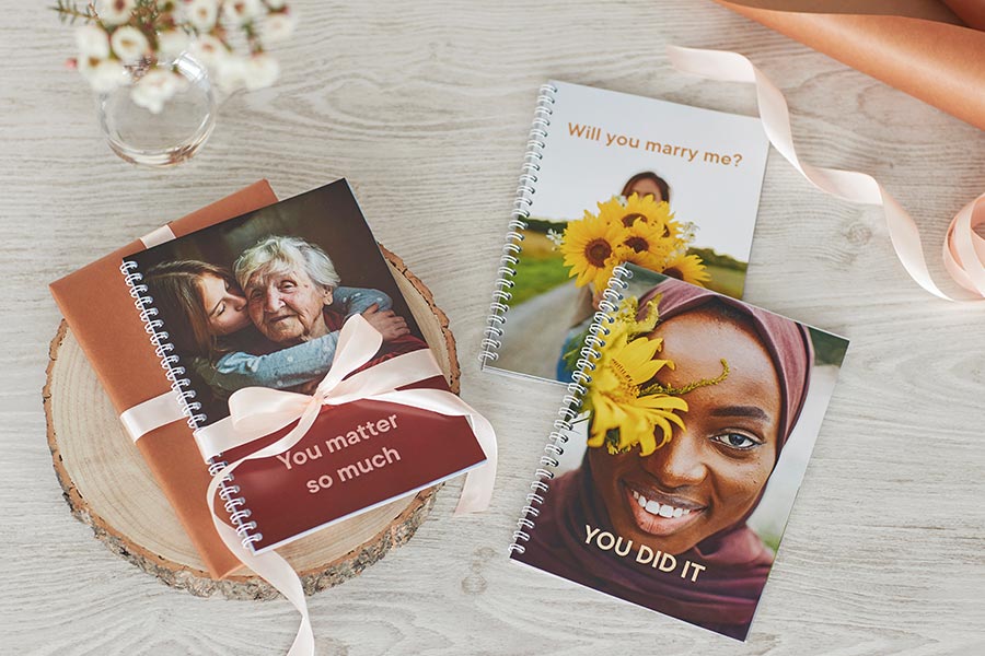
A photo book is a personal gift
A photo book can bring joy or comfort, be silly or even help you pop the question. It's a personal gift. Save these unique gift ideas for later!

Great winter photos in all weather conditions
We reveal great photography tips on how to capture beautiful shots with your camera or smartphone in winter conditions.

Valentine's Day Card Messages for Your Greetings Cards
Surprise your loved one on Valentine's Day with a photo greetings card with a personal message. Below you will find some inspirational card messages.
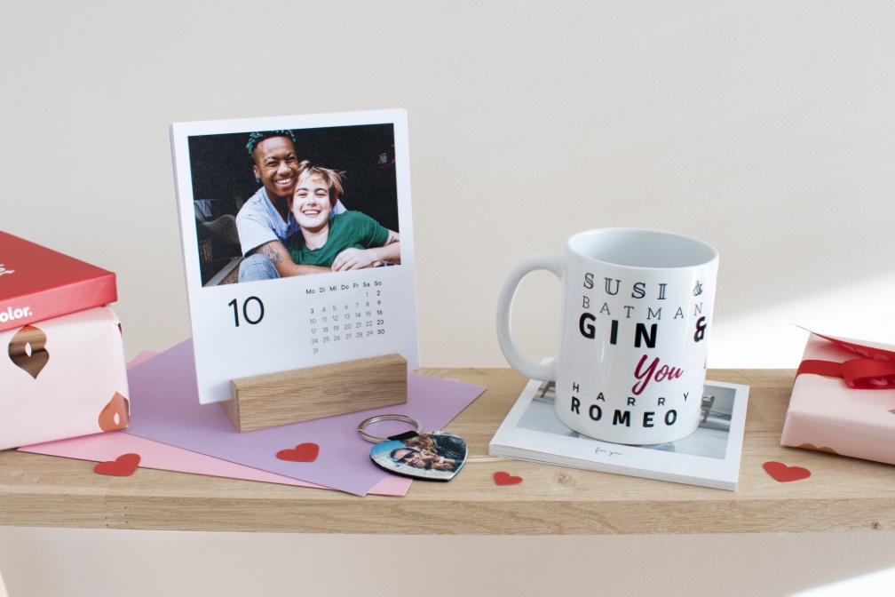
Quick Last-Minute Valentine’s Day Gifts
Quick last-minute Valentine's Day gifts: 8 photo gift ideas to surprise your favourite person with.
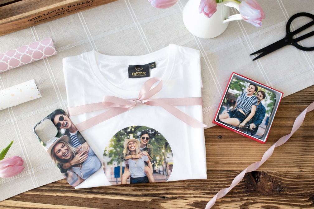
Valentine's Day Gifts for Best Friends
Galentine's Day gift ideas: surprise your best friends with creative photo gifts for Valentine's Day as pictures are worth a thousand words.
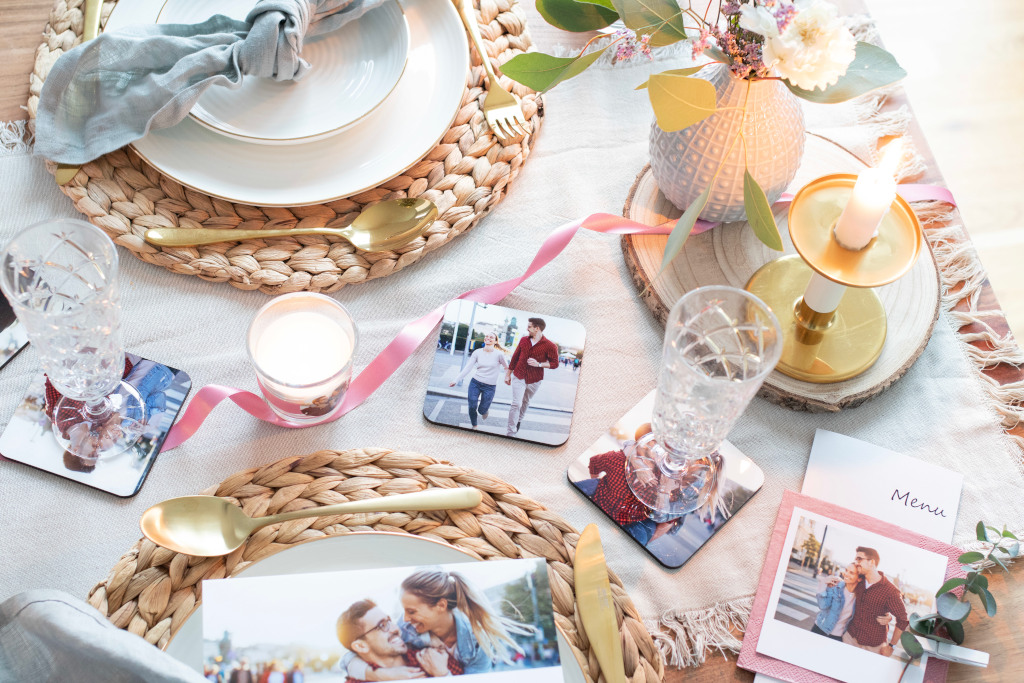
The perfect candlelight dinner
Valentine’s Day is coming soon! We’ll give you tips for a romantic evening for two and show you cute DIY ideas for the perfect table decoration.
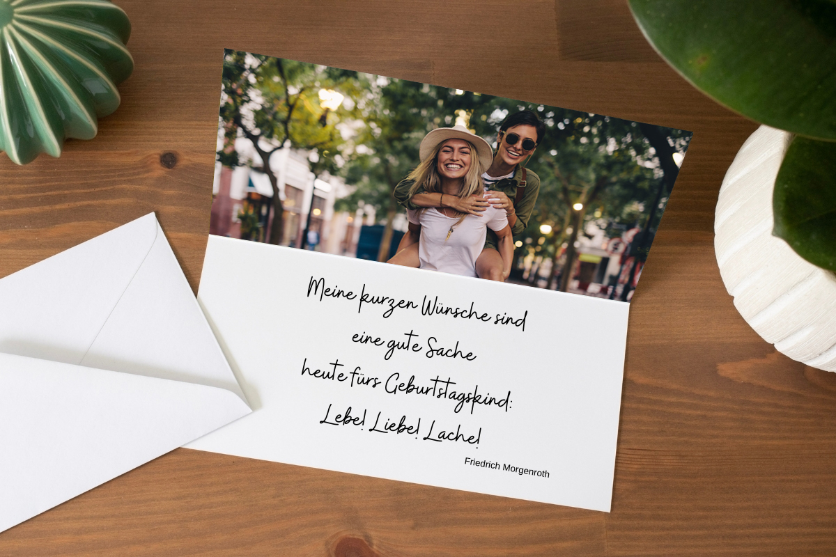
Enrich your photo gifts with a lovely poem
Add a beautiful poem to your photo gifts for that special touch. Get inspired to create a fantastic gift for any occasion.
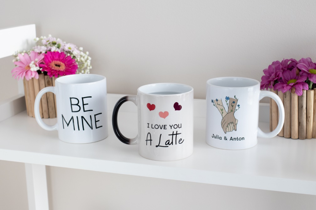
A Handwritten Love Note on a Mug
Get inspired and print your own handwritten love messages or works of art on Photo Mugs.
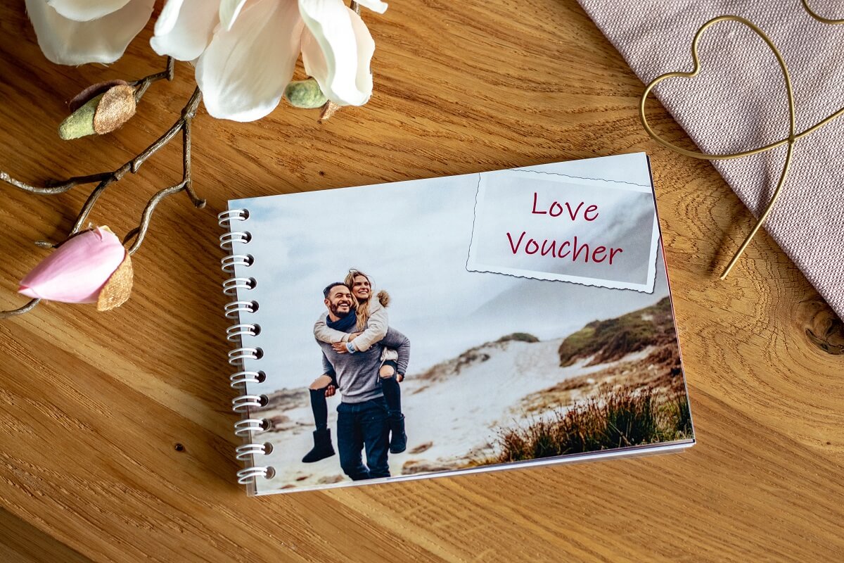
Romantic Love Vouchers for Valentine’s Day
A book with personal gift certificates is a lovely gift idea for your significant other this Valentine’s Day. Here we’ll give you some tips for its design.
