Guest contribution
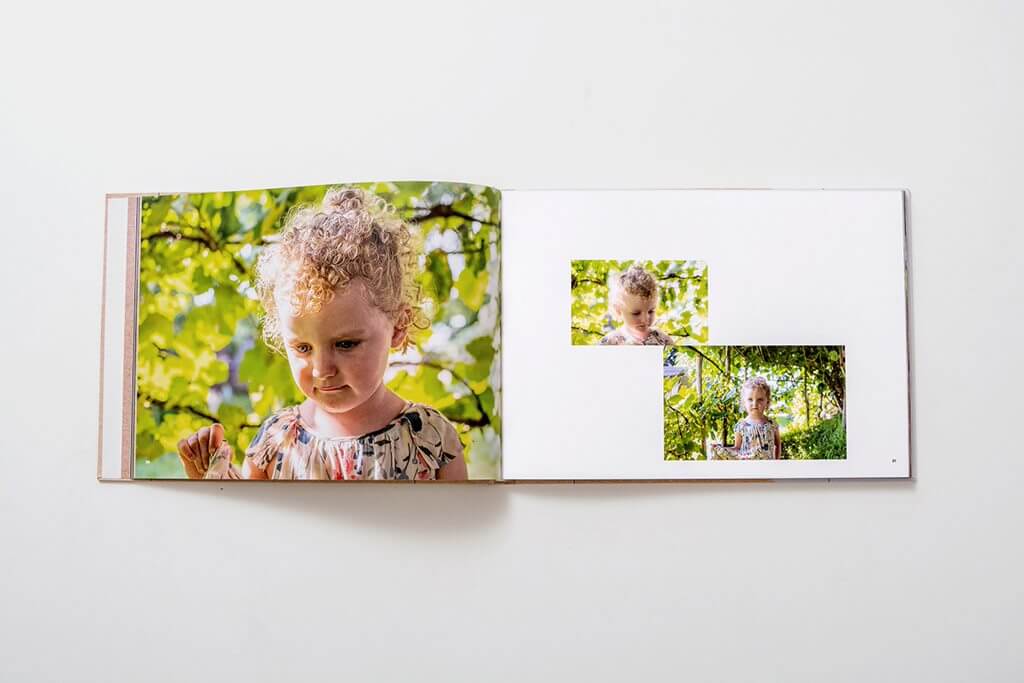
Optimise images for photo book
Improve the print quality of your pictures with useful tips.
Printing resolution
In printing, the image composition is converted from pixels to halftone dots, which are printed in the photo book in the four basic colours cyan, magenta, yellow and black. The halftone dots are so small that you can only see them with a magnifying glass.
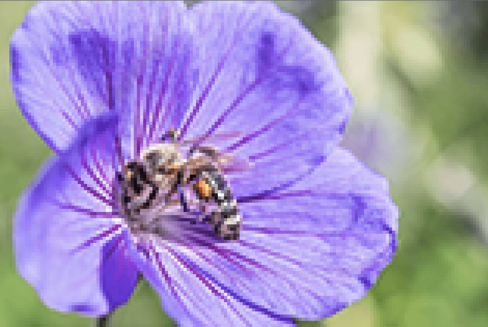
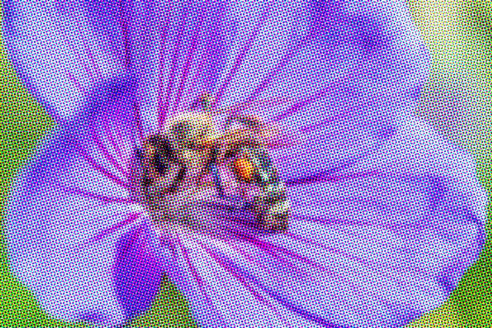
A detailed rendering of an image can only be achieved in print if the image is available in a certain resolution. Resolution is calculated from the number of pixels in width and height. For example, a 12 megapixel mobile phone camera produces images of 4000 x 3000 pixels. A 24 megapixel SLR camera produces images of 6000 x 4000 pixels.
To obtain a detailed rendering in print, the image must have a minimum resolution of 150 pixels per inch (ppi), otherwise the image will be blurred, fuzzy or pixelated.




If a critical value of 150 ppi for an ifolor photo book is not met, the warning message "Resolution too low" will be displayed to indicate that the image has insufficient resolution. In this case, the image should be reduced in size until the warning message disappears.
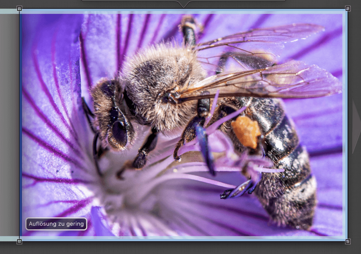
To calculate how much you can enlarge an image in ifolor Designer, you need to know how many pixels the image has. You can look up the number of pixels in the metadata in Lightroom or in Photoshop in the menu item Image under Image size. You can see the number of pixels in ifolor Designer directly in the image bar on the left with the small icons.
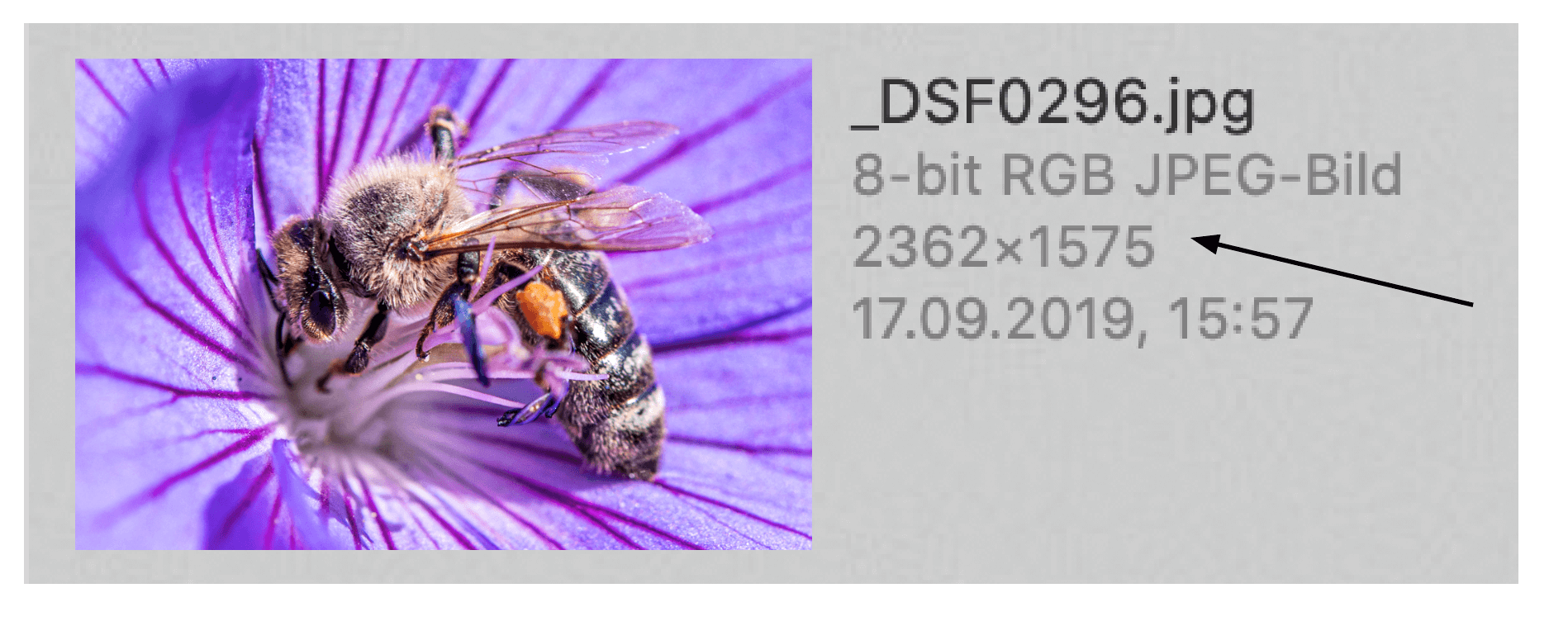
The number of pixels is used to calculate the image size for optimum print quality in the photo book. Simply divide the number of pixels in width and height by 120 to get the size in cm.
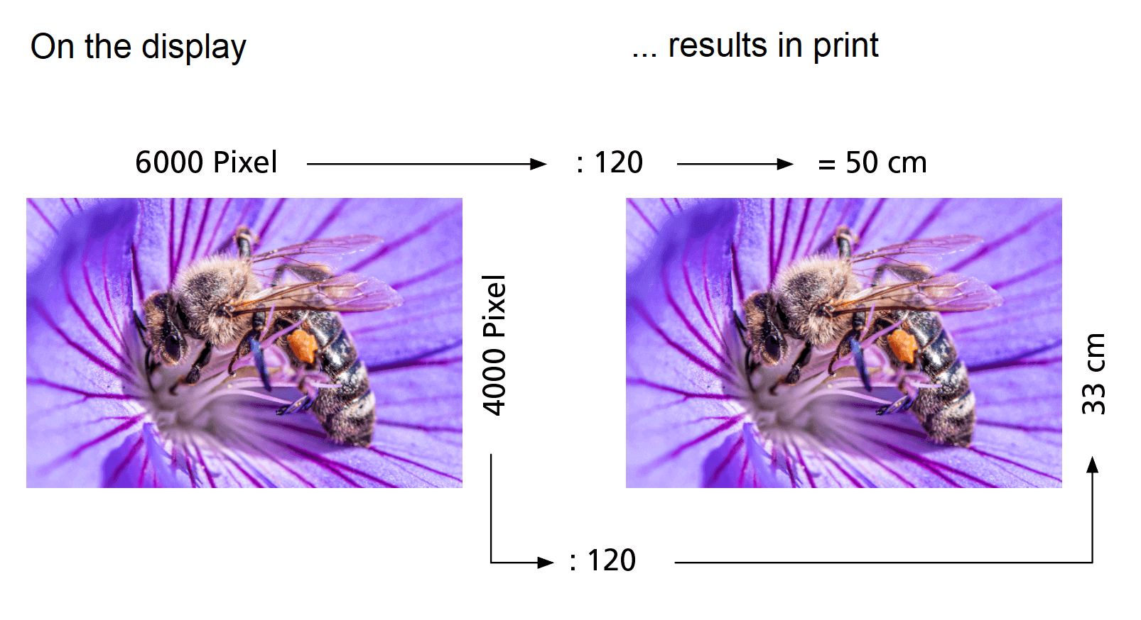
An image of 6000 x 4000 pixels when printed at 300 ppi results in an ideal image size of around 50 x 33 cm.
Contrast, saturation and brightness
A photo book is produced using digital printing, a standardised process that ensures that everything is perfectly coordinated. If a photo book does not turn out as expected, it is most likely due to the photos and not the printing process.
Images in ifolor Designer are displayed with the three basic colours RBG (red, green, blue). These colours are converted into the four basic colours CMYK (cyan, magenta, yellow, black) for printing. As a result of the different technologies, images in print always look slightly different than on screen. For example, you can have rich blue or violet tones on the screen, but in print they turn into a dull blue or violet. Photos on your monitor should never be compared with printed photos.
Due to the conversion from display to print, images will be printed in slightly duller colours and with less contrast.
When printed, the mid to three-quarter tones tend to be reproduced a little too dark. For this reason, you can optimise all the images in the photo book during the ordering process or you can do it yourself when editing the images. Click on an image and select the Edit button below.
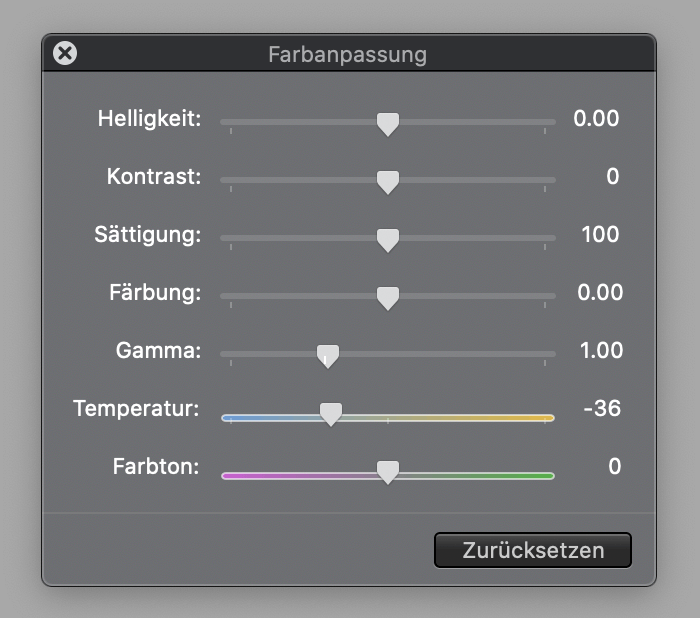
This means that all images will have to be enhanced in Photoshop, Lightroom or even in ifolor Designer to give them slightly more colour and contrast: Under Colour adjustments, using the sliders contrast, saturation and gamma you can optimise the images for printing. These are minor differences, and you can tell immediately when the images begin to lose authenticity or quality. So don't overdo it.
Lightening skin tones
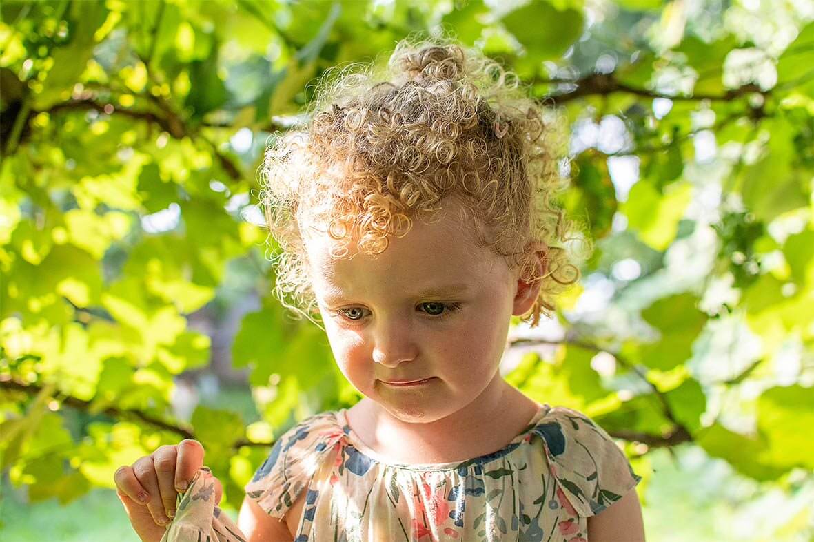
Shadowy skin tones may turn out too dark in images taken in direct sunlight. For technical reasons, dark tones tend to clump together when printed, which means that they are more likely to become even darker.
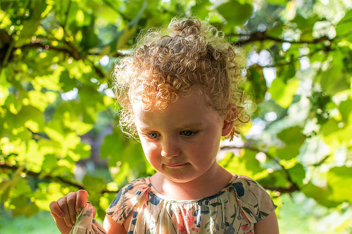
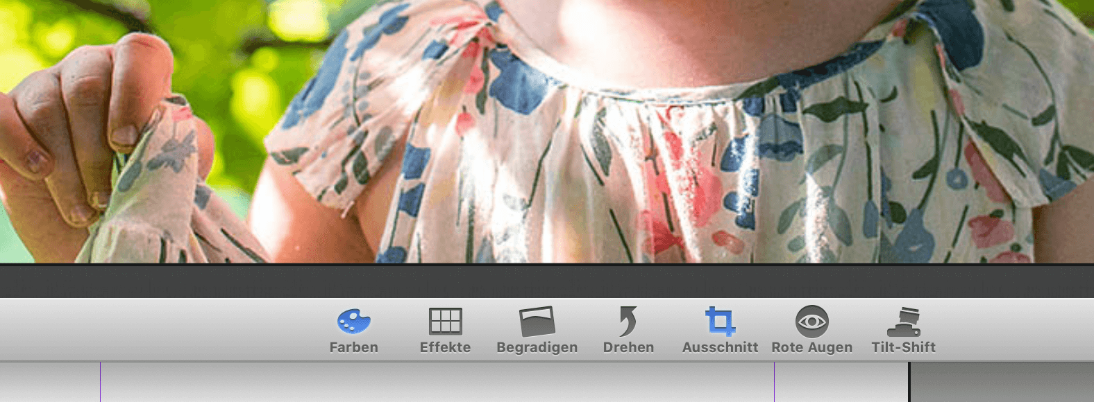
Images can be lightened directly in ifolor Designer. Click on Edit under layout. Then proceed to colours.
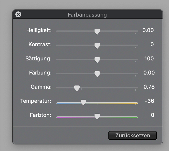
There are two ways to lighten skin tones that are too dark. The brightness lightens the image across all tone levels. This means that areas of the image that are fine are also made brighter. The gamma slider, however, produces better results, as it mainly lightens the midtones. The gamma slider should be dragged a little to the left to achieve this. Watch on the monitor how the skin tones change. Make subtle adjustments and be careful not to overdo it.
Neutralise colour cast
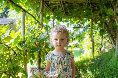
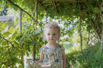
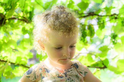
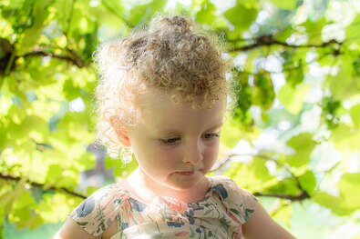
In forests or under a leaf canopy sunlight appears greenish due to the foliage. Green light affects all the colours present and the image becomes greenish. Such a tint can be compared to colour temperature because light is warmer in the morning and evening than during the day when the light is more neutral to bluish. A tint may well be desirable as a colour scheme at sunset. However, a green tint on faces looks unnatural.
In ifolor Designer you can easily neutralise a green colour cast using the colour pictogram under colour adjustment. Drag the temperature slider slightly to the left and watch what happens in the image. Be careful not to adjust too much, a little bit of colour ambience is fine.


Ralf Turtschi
Ralf Turtschi has made a name for himself as a specialist book author and journalist. He works as a photojournalist, is a hobby photographer and lecturer and gives technical and creative advice on all aspects of photography. He is particularly fond of nature, landscape, portrait, travel, macro, architecture, and night photography.
Further information: www.agenturtschi.ch
